

.png)
Every day, grantmakers generate and process large amounts of grant, contact, and communication data inside GivingData. Productivity can be inhibited by information overload as a result, but we know that the right tools can help foundations visualize and give meaning to their data.
That’s why we’re proud to announce the release of Chart View, a powerful new data visualization tool fully integrated with GivingData’s Super Search functionality. Chart View gives grantmakers the ability to create custom charts to analyze data and inform their grantmaking strategy.
Any GivingData user can now create and save clear comparison and trend charts from datasets built using our Super Search feature, without needing to export data to Excel or other data visualization tools.
Whether a program officer wants to chart the status of all grants in their portfolio, or a grants manager needs to show trustees a high level view of their foundation’s grantmaking, Chart View simplifies the creation of visualizations that can be shared, saved, and analyzed.
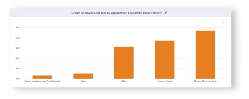
Use charts like the one above to compare grantmaking data across multiple codes and attributes. |
Because Chart View is powered by GivingData’s Super Search functionality, grantmakers can build complex datasets by layering search criteria from multiple entities, and then selecting specific fields of data to display.
With one click the user can now switch to Chart View to create dynamic data visualizations. Once in Chart View, they can choose between two type of charts – one to compare data sets and the other to view data trends.
Comparison charts are ideal for analyzing different groupings of aggregated data. For instance, visualizing the grants awarded last year by any grant attribute, such as program area, geographic region, or type of support. Users can also analyze internal process data, such as grant review workload, with a chart that shows grants distributed by program staff.
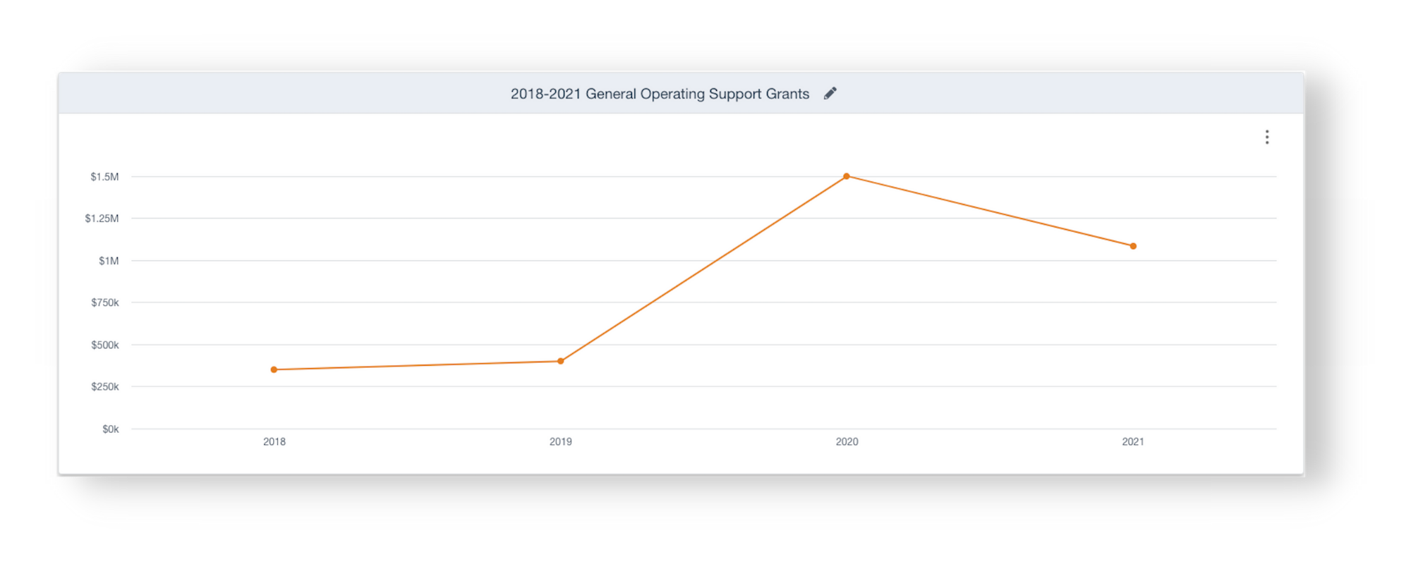
Visualize data trends over any period of time using the Trend View option within Chart View. |
Alternatively, trend charts show data over time. They are perfect for displaying data such as year over year funding trends or total number of organizations funded. In addition, you can get a better understanding of how grant approvals or grantee report deadlines occur throughout the year by grouping approval dates or report due dates by quarter or month. Trend charts promise to be particularly useful when exploring how a foundation has modified (or not) its giving (e.g., type of support, type of organization) over the years.
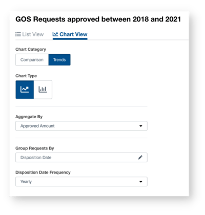
Adjust data settings such as date frequency and data grouping directly from the Chart View control page. |
As an extension of Super Search, Chart View promises to become an “everyday” tool for staff across the foundation. The ability to visualize the results of Super Searches will add tremendous value to the work of foundations, amplifying the ability of funders to make data informed decisions and act on the information they are collecting as part of the everyday work.
Learn more about Chart View and see it in practice by viewing our recent New Feature Review webinar, which also features an in depth update on GivingData's payments and approvals dashboards and scenario planning tool.